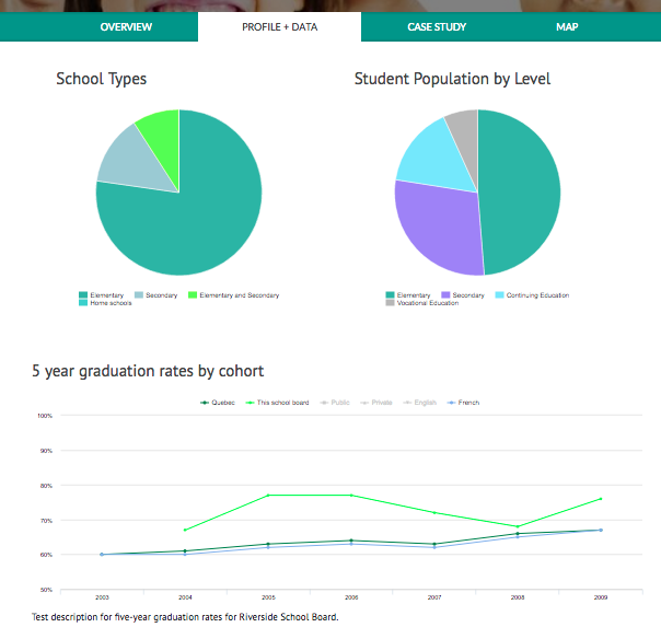
The Evidence Based Practice Project is working to improve student outcomes, and already has a website to publicize their efforts. But to be really convincing, they need more than just prose—they need data! In this session, you'll learn about how we added pie charts, comparative line graphs, timelines and maps to this site.
To display pretty charts, you first need to have data points to show. Using Drupal's Field Collections, Entity References, Paragraphs and Views, we were able to both add new data and reorganize their existing data, so that all the relationships made sense. We also made use of and extended Drupal's editing facilities so that staff could easily add and update information.
Drupal already has dozens of modules for graphs, maps and other visualizations. We'll tell you why we chose the modules we used, such as Charts and Highcharts, Geolocation and Simple Timeline. You'll also hear how we also had to extend these modules and theme them to meet the client's needs.
As a bonus, we'll talk about a simple module to improve Highcharts which we'll be releasing to contrib!
A desire to learn more about Drupal!